Hello all,
I am often asked to post progress photos of my work. This is something which fascinates me when studying other artists, as it provides insight into how they think about creating their subjects from start to finish. I’ve documented a few of my previous pieces in order to show a specific technique. “Passages” is one such piece, where I used a monochromatic underpainting with Viridian Green. If you scroll down, posts of that can be found in this blog. However, I realize that I’ve never really shown my approach to creating a work of art from the very beginning. Part of my process, often includes a value study, then a tracing and then a linear transfer to the painting surface. These crucial steps allow me to make as many important decisions and corrections as needed before I even start applying actual paint. I especially like to use this method for pieces where there are many details. It is also very helpful for planning out a more involved composition. Rather then continuously changing elements once I’ve begun the painting, the following technique allows for little if any changes past the transfer stage. Below is a detailed documentation of a large commission which I did for a Bucks County judge. I’ve done my best to describe each step along with my problem solving techniques throughout the course of the 11 month journey that I spent working on this.

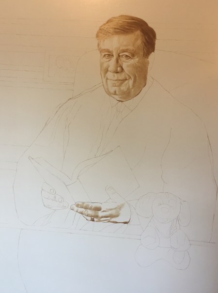
After I had my initial photo shoot with the judge, I narrowed down my references from over 100 photos to roughly a dozen and proceeded to create the large value study pictured above, using charcoal and white chalk on gray toned paper. This study was done in the same proportional scale as the painting was to be. The objective here was to decide upon all of the main compositional elements. The details of each individual part are not as big of a concern for me at this stage as much as the overall picture. My primary concern is the positioning and size of the figure in relationship to the surrounding parts, as well as the value emphasis, lighting and how it reads as a whole. Once the study was complete, I showed my client to figure out whether any adjustments or additions needed to be made.

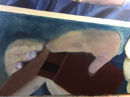
The linear tracing is where most of the major adjustments occur. The photo above shows exactly how I do this. In this case, I actually re-drew the judges’ face on a separate piece of paper (completely changing his hair and expression) then cut that image out and taped it over the original face. Upon showing him the original study, he wasn’t particularly pleased with his expression, as he thought it made him look too stern. I also slimed down his chin and neck-line a bit. It is much easier to make these adjustments early on, rather than waiting until I’ve invested a lot of time into the painting. I also adjusted the size of his hands (they seemed too small to me in the first study) and parts of his robe. The background detail was simplified into just a few lines. There’s no need to draw out every single book. Now it is ready to be transferred to the prepared wooden panel!
The lines have now been traced onto my pre-primed, pre-toned wooden panel with Raw Umber. I do this by coating the back of my tracing paper with the paint (without medium) using a relatively stiff bristled brush. I rub it into the paper evenly so that there are no ridges or clumps in the paint. I will usually only rub it over the lines, (rather than the entire surface of the tracing paper) allowing the area of paint to be slightly broader than the original line. I then tape it to the panel, with the paint coated side against the panel and retrace it with a pen. This leaves the impression of each line on the panel. I then proceeded to apply a wash of the Raw Umber into the areas where there was shadow in the face and hands only. This allows me to begin thinking about how I will eventually model my form with mixtures of opaque paint. It also provides a warm undertone which will add optical color effects to the next layer of paint. I continued making minor corrections at this point, such as raising the line of the left shoulder.

Underpainting I

Underpainting II
I’ve used many terms to describe the type of underpainting pictured above. It is simply an opaque layer of light and dark values with only a slight hint of color. This layer can be done in gray tones only, or with some warm and cool variation, or it can be done with one dominant color, such as green, or brown in order to provide an overall hue which will be evident even in the final image. For this piece I mixed up a series of values using white and black which gave me cool grays. I then mixed up additional values using white and Raw Umber which gave me warm grays. I like to introduce the play of warm and cool grays in the underpainting, as this creates the illusion of form, and it also begins to mimic the effects of light. In this case, his face is being illuminated by a window light, which is cool, in contrast to the warm shadows. Because there is limited color in this layer, I refer to this as the Dead Color layer.

Overpainting I

Overpainting II
This next layer is one which gives the painting life! I refer to it as the first color pass. I use a full palette here, and work out all of my subtle detail, including pores, wrinkles, freckles, etc. The first color pass closely adheres to the value structure of the underpainting, and simply adds that life-like appearance. I consider the underpainting or Dead Color layer to be the one which molds the basic form, much the way a sculptor might create a clay model to establish general planes and proportions which he would then continue to refine. The addition of color takes all of that wonderful simplified sculptural form and breathes life into it, embellishing upon the details, and adding those subtle organic variations of pigment that make humans look human. I also created a halo of the background colors around his head in order to start making some basic decisions about my color relationships.

Moving away from the face now, I begin massing in large areas of color. My goal is to block in these areas rather quickly, so that I can get back to refining my detail. The large patches of dark orange to the left of the judge are applied semi-transparently, allowing for vertical brush strokes to show. This is intentional as it simulates the appearance of wood grain. I’ve also drawn an outline in paint of a small figurative statue which the judge decided to include.

Here is a detail of the statue, which I actually ended up moving over, as I didn’t like how the bottom of it was cropped out by the sleeve of the judges’ robe. The original outline is where I decided to add the brown shadow pictured above. I’m slowly working out my values for the statue now with opaque mixtures, using only white, blue, brown and black paint. I also am continuing to work out the detail of the wood grain around the statue using the effect of both transparent washes, combined with carefully painted light and dark strokes.
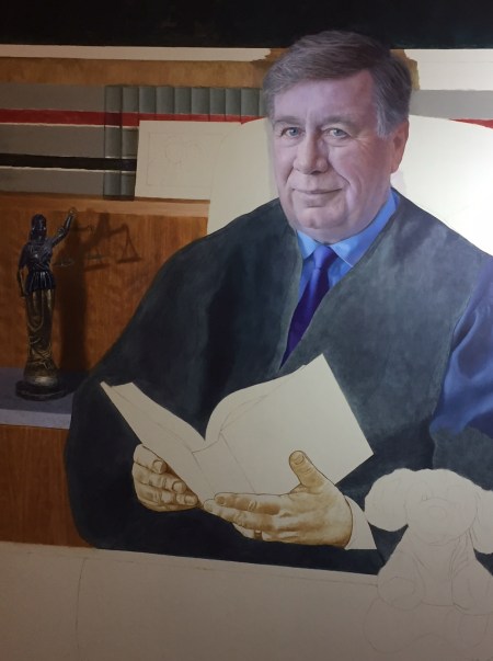
Here I continue to add background details, including the individual books on the book shelf.
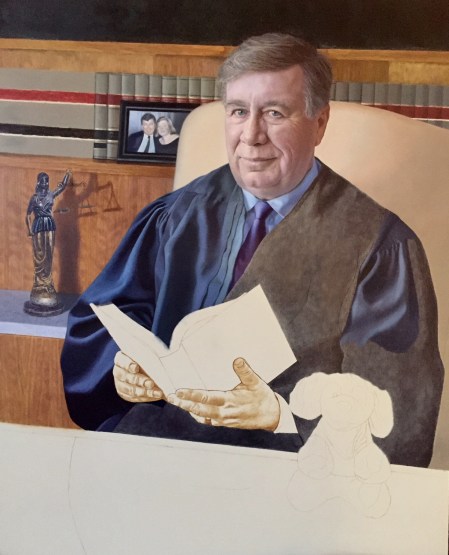
Slowly but surely the detail work continues. I’m now starting to define the folds in the robe. I’m also making some pretty significant color adjustments. The blues in the robe are strengthened in order to describe the cooler color effect of the window light, which makes more sense when paired with the flesh tones of the judges’ face. I’ve also blocked in the back of the chair and painted in the detail of the small photo of the judge and his wife (detail included below) to the left side of his face.

(Detail)

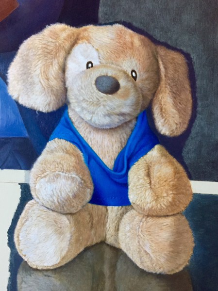
Now I’m switching my focus to the lower half of the painting. Don’t ask me about this detail! It was important to the judge, so I went with it. The texture of fur can often be challenging. I decided it would be best to underpaint this in raw umber (as seen on the dog’s face above) in order to establish all of the detail, and then, once dry, section glaze it with a mixture of Raw Sienna and Transparent Red Oxide, then rework the details back into the wet glaze with opaque paint (as seen on the left ear). That method worked well! Below is the finished detail.
(Detail)
In addition to painting the dog’s fur and shirt, I began to work out the reflection in the glass table. The reflection was painted with a wet in wet technique, which is really the best way to capture the blurry effect. If colors need to be adjusted, they can always be glazed over, however, in this case I carefully mixed my color variations so that I wouldn’t have to add any additional layers. I’ll admit, I was starting to get antsy at this point as I had all ready invested about 8 months into this project. Below are some additional details of the reflection in the table. Adding this part gave a lot of depth to the painting.
(Detail)

(Detail)
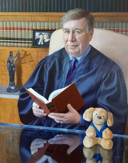
Above is the completed painting! I continued to refine my details with a combination of glazes and direct painting techniques. Upon delivery, the judge was quite pleased! It’s great to know that this will now be hanging in the Bucks County Court House for all the public to see.
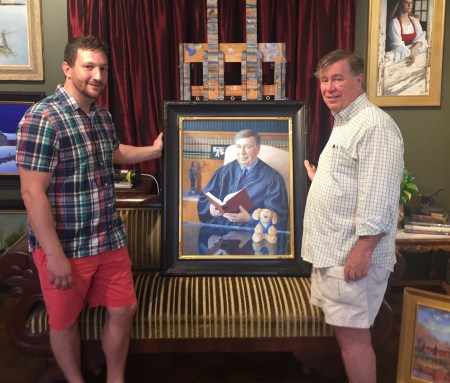
Above: me (left) standing with the honorable judge Mellon (right) next to the official portrait painting which will hang permanently in the Bucks County Court House upon Mellon’s retirement.
In closing, I’d just like to offer my expertise to anyone interested. For information on classes that I teach which cover all of the techniques described here, please check out my website, http://www.riverafinearts.com. Happy painting everyone!
