Basic Drawing Take Home Assignment (values on toned paper)

March 1, 2023

For this assignment you may select from any of the photos below and create a tonal drawing using your light and dark charcoal as well as your blending tools. For your mid tone areas, you should utilize the tone of the paper. This means that you will NOT cover every single portion of the paper with a medium. In many cases you will be lightly veiling over the paper with either the light or dark charcoal to slightly alter values. In other cases you will leave the paper untouched. I would recommend starting with the most obvious value differences to establish a general tonal design and slowly start working in the more subtle ones (video demo provided below).

As always, I would recommend starting with your vine charcoal sticks. This is the easiest to erase, so I’d use this to draw out your initial shapes. Remember to take your time and measure proportions to ensure that everything will fit on your paper. Use center lines and construction lines where needed. I’d also include the shadow shapes in the linear stage. Once you’re comfortable with the linear drawing you can start adding your values. I would suggest starting with the lighter tones using your white charcoal pencil. Once you begin adding the darks, proceed with caution. Remember it’s much easier to “build up” your darks in layers, but it’s harder to make a value lighter if you go too dark. When you’re ready to push your darkest darks, you can switch to your charcoal pencils. You may also blend as you go with shading stumps and/or paint brushes.

Materials:

Strathmore Gray or Tan toned drawing pad (11 x 14 inches)

General’s white charcoal pencil (medium or soft)

Vine charcoal sticks

Compressed charcoal sticks

General’s charcoal pencil (dark)

Kneaded eraser

Once you have completed the assignment spray it with fixative and bring it to class on Tuesday, 3/21 for review.

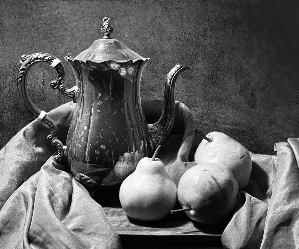
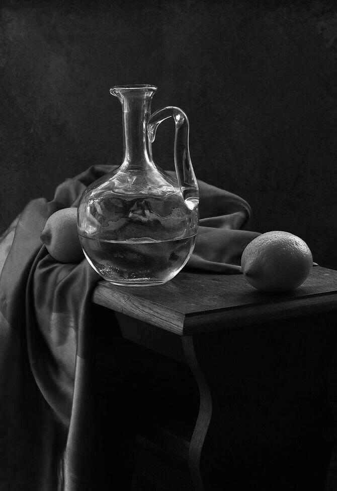
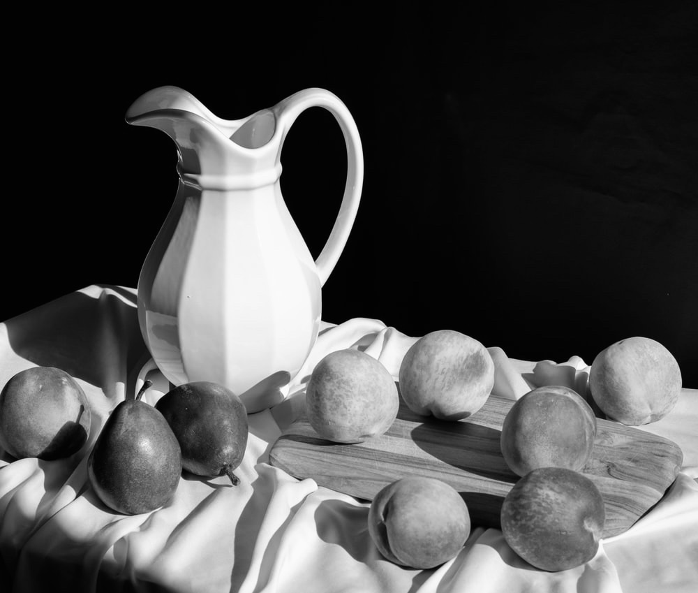
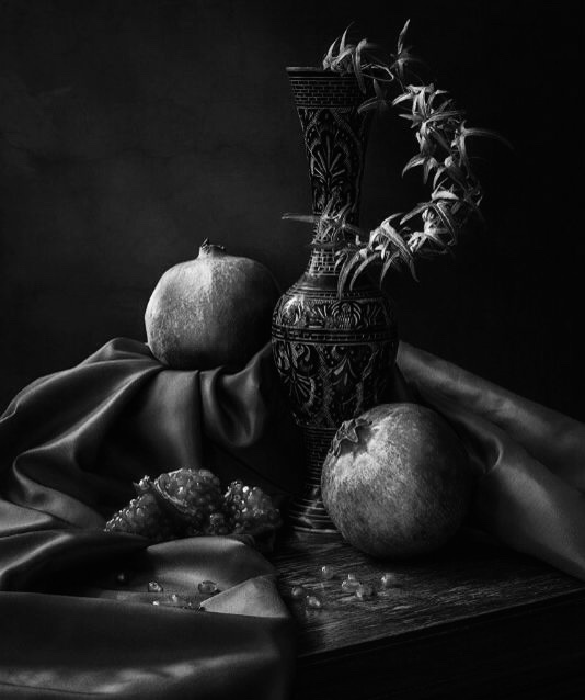
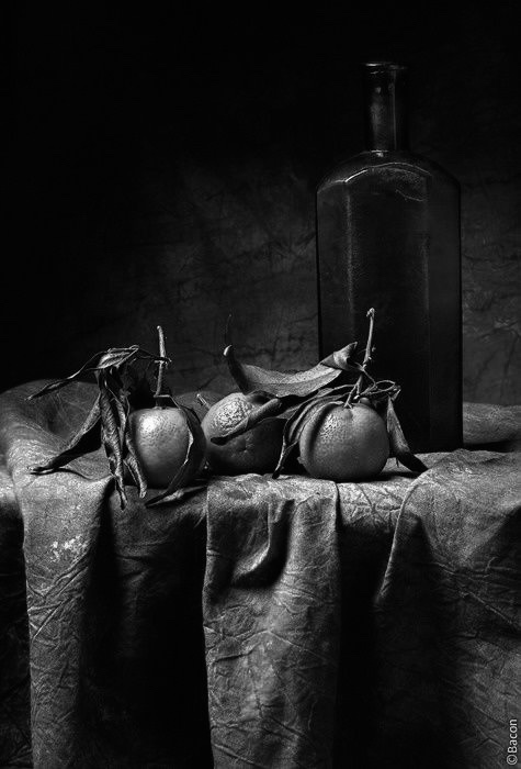
Below are photo references for you to select from for this drawing. If you’d rather create your own still life, you may, just be sure that you are creating enough value contrast. Ideally you want to have fairly equal portions of light, mid tone and dark values.

Good luck!

Video demo below:

Photo References:


Transferring A Drawing Using A Grid

March 5, 2021

Below is a short video explaining how to use a grid to recreate an enlarged linear drawing of Vermeer’s painting, “A Girl with a Pearl Earring”. This was a technique which was very often used throughout the Renaissance as artist’s often transferred detailed studies onto their canvases or panels on a larger scale. The grid allows the artist to adjust the size of their drawing to fit their canvas with perfect accuracy.

It is believed that Vermeer used this technique in combination with the camera obscura (see illustrations below). He most likely traced his outlines onto a piece of glass using the projected image from the camera obscura, and then gridded it out to transfer the image onto his canvas on a larger scale. In an effort to reconstruct this painting using Vermeer’s methods, I placed a grid over my reproduction using half inch squares. I then measured out a grid on a piece of tracing paper using .75 inch squares which will end up being close to the size of Vermeer’s original painting. I decided to transfer my drawing onto tracing paper (instead of directly onto the canvas) and then do an oil transfer onto my prepared canvas. For a video on that technique, please check out this link.

Below are a few illustrations of camera obscura designs which work very similarly to the modern day projector.

Demonstration on using a proportional grid to create a transferable drawing.


Vermeer’s Ground Preparation

February 19, 2021

Below is a video explaining Vermeer’s ground preparation for “A Girl with a Pearl Earring”. I am using historical colors to be more authentic which required researching Vermeer’s pigments, finding sources which manufactured them, then preparing the paint myself by mulling the raw pigment with oil, however I am using store bought brands for some of the colors. You can substitute the Bone Black with Ivory Black. The Yellow Ochre and Red Ochre used in the ground was purchased in ready-made form. It’s also important to note that I am using higher quality store bought brands such as Rembrandt, Old Holland and Charvin. This will be especially important for the upper layers of this painting which I’ll explain in future lessons.

Please watch the video below which demonstrates how I mixed and applied my ground. This step should be done well in advance to ensure sufficient drying time prior to starting the painting. I will post another video shortly on how to prepare the drawing which will be transferred onto the canvas once the ground has dried.

Good luck!


Paper Toning

February 1, 2021

Hello students,

Below is a short video on how to tone your paper using an Acrylic ink and water mixture with a fresco brush. One advantage to toning your own paper is that you can dilute or concentrate your wash to produce a specific value tone. You can also apply several coats to darken the value or modify the color. This should be done in advance of executing the drawing to ensure that the paper is fully dry. An hour should give you plenty of time.

When toning, the first important step is to tape your paper to your board. Make sure it is flat and tightly secured to your board with a quality artists tape. When you first wet it, wrinkles will form, but they will settle as the paper dries.

When using the Canson Mi-Tientes, I prefer to use the smooth side. If you’re not sure which side is smooth or textured, you can check by brushing a small amount of your wash on both sides. The textured side will yield a waffle-like pattern whereas the smooth side will produce a solid, even tone.

Good luck!


Flemish Painting Techniques (Linear Transfer)

December 6, 2020

Hello students,

Below is a video explaining how I executed the oil transfer onto the prepared support. This method allows us to establish a drawing with clear linear precision which will ensure a strong start to the painting. From here we will add values and eventually color. This method was practiced religiously during the early and middle Renaissance and mimics that of the famous Jan Van Eyck.

For the imprimatura I used Yellow Ochre and Raw Sienna in a 50/50 mixture. This was thinned out with a small amount of turpentine and brushed semi-transparently onto the white ground. Once dry, I used a coating of Raw Umber for the linear transfer which I explain in the video below.

Please let me know if you have any questions!


Advanced Portrait Drawing (warm & cool tones) Reference Photo

November 23, 2020

Hello students,

Below is the reference photo for my “Advanced Portrait Drawing (warm & cool tones)” master class.


Advanced Portrait Drawing (3 color on toned paper)

November 23, 2020

Hello students,

I would like to welcome you to this in-depth drawing course which explores the use of colored pastels and charcoal. The content of this course is based on a traditional technique consisting of a palette of only 3 colors, (black, sanguine and white). By limiting our color choices, we are able to fully explore a subtle range of warm and cool flesh tones. In the process, we will learn how to harness the subtlety that this palette offers.

In addition, I will discuss many other topics such as proportion, anatomy, shading, blending and layering. If you have taken any of my previous online classes on http://riverafineartstudios.Thinkific.com, such as “Portrait Drawing” or “Advanced Portrait Drawing”, you will already be familiar with some of the terminology. One of the main differences however, is the use of color.

If you are interested in painting with a limited palette or simply want to learn more about warm and cool color relationships, this course is a great option. My “Flemish Portrait Painting” class will be coming soon, and this drawing class would be a great prerequisite to that. I’m very confident that the information provided in this class will prove beneficial and help you in your artistic journey.

Below is a list of my materials as well as the reference photo which I’ll be using for my demo.

Thank you very much for choosing my drawing course. I really appreciate the support and look forward to your questions and comments.

Sincerely,

David C. Rivera

http://www.riverafinearts.com

Materials:

BFK Rives gray paper (22 x 15)

Prismacolor NuPastel #277-P (ivory)

General’s white charcoal or white pastel pencil

Faber-Castell Pitt Pastel pencil #1122-191 (sanguine)

General’s charcoal pencils (HB, 2B, 4B)

Nitram charcoal sticks (HB, B)

Nitram medium charcoal powder (see note)*

Kneaded eraser

Fine sandpaper

Blending brushes (I use mostly chisel blenders and soft rounds, designating different brushes for light and dark mediums)

Double sided shaders

A soft rag or chamois cloth

* Note: charcoal powder can be purchased from Jerry’s Artarama, however I prepare my own. Using a brush, I deposit the residue left on my sandpaper from sharpening my tools directly into small containers fitted with a lid.

Photo Reference Below:


Project 6 (transparent shapes with primary colors)

October 21, 2020

Hello students,

Below are the directions for project 6.

Like project 5, you will be working with transparent shapes, except this time you will be using all 3 primary colors instead of just one. This means that any section where 2 primary colors intersect one another, they will blend optically to form a secondary color. If one color has a higher concentration or chroma than another, the intersection will than become a tertiary color. The terms primary, secondary and tertiary are what make up the color wheel and we should try to become familiar with them. I’ve included descriptions below to make it a little more clear.

Primary – a color which serves as one of the 3 dominant hues on the color wheel and influences the secondary and tertiary mixtures. The 3 primaries are red, yellow and blue.

Secondary – a color which has components of 2 primaries such as an orange which has the influence of both red and yellow hues. The secondary colors are orange, green and purple.

Tertiary – a variation of a secondary color which has a stronger influence of one primary hue. Examples of tertiary colors would be a red-orange, yellow-orange, blue-green, yellow-green or red-purple, blue-purple.

In composing your designs, you want to have a display of all 3 primary and secondary colors. You may also include tertiary colors if it fits the design. For example, if an intense blue intersects a red that has been tinted with white, then the intersection should display a tertiary color of a blue-purple. Below are some examples.

This design is to be created on a 15 x 20 hot press illustration board with acrylic paint.

Good luck!


Project 5 (transparent shapes)

October 8, 2020

Hello students,

For project 5 you are to create a simulation of overlapping transparent shapes using 1 primary color plus black and white.

Try to imagine what 2 pieces of tinted glass or plastic would look like if they were placed one over the other. Ultimately you would see an increase in the chroma (intensity of color) and, if more and more pieces were added, eventually the value would get darker as there would be a decrease in transmitted light.

In your design, you want to use flat, solid colored shapes of the same hue, but that differ in value and chroma.

You should include all 3 of the following color variations in your design:

1.) Tint – 1 primary color + white

2.) Shade – 1 primary color + black

3.) Tone – 1 primary color + gray

Remember that you are ultimately trying to create the illusion of transparency. This means that the intersection between 2 colors should be a direct result of those colors. For example, if 2 tinted reds are intersecting one another, then the middle portion will obviously be a deeper/darker red, but only marginally so. You don’t want to exaggerate your contrasts or have too little contrast. You have to use your eye to gauge the color relationships which means that you’ll probably have to periodically adjust the value, chroma and hues within your design.

Below are some examples to hopefully give you a better idea.

This assignment is to be created on a 15 by 20 inch hot press illustration board with a 1 inch border.

All imagery must be painted using Acrylic paint.

Neatness counts! Please use a ruler for measuring and consider using artists tape for painting straight edges!

This assignment will be due on 10/14.

Good luck!


Project 4 (5 Value Painting)

October 1, 2020

Hello students,

For project 4 you are to create a non-representational design using 5 values. You will mix your values with black and white acrylic paint. The straight black and white paint will be used as 2 of the 5 values. Your remaining three values should be mixed and display equal contrasts between one another. To get started, think about mixing up percentages of white to black. If you are starting with 100% white for example, then the next darkest value should be a mixture of 75% white to 25% black, followed by a mixture of 50% white to 50% black, etc. This is only a starting point to give you a base, however it is important to visually gauge these value differences. Percentages don’t always work because the black tends to dominate the white. For pointers on how to mix your values, please see the video below.

For this design you will be using a series of non-representational shapes – these can be geometric or organic. Each shape will have a designated value and you want to use all 5 values equally within your composition. For any white areas, you must use white paint! Don’t leave areas blank except for your borders.

Instructions/materials:

Your design will be executed on a 15 x 20 inch hot press illustration board.

You will measure out a 1 inch border on all 4 sides of your board. The design will be contained within these borders.

You will be mixing your values with Mars Black and Titanium White Acrylic paint.

The design should include shapes of varying sizes. Think variety.

Each shape should be a solid value and all values should be equally balanced within the composition.

Due date:

This assignment will be due on 10/6 at 4 pm.

Good luck!