Hello students,
Below are the directions for project 6.
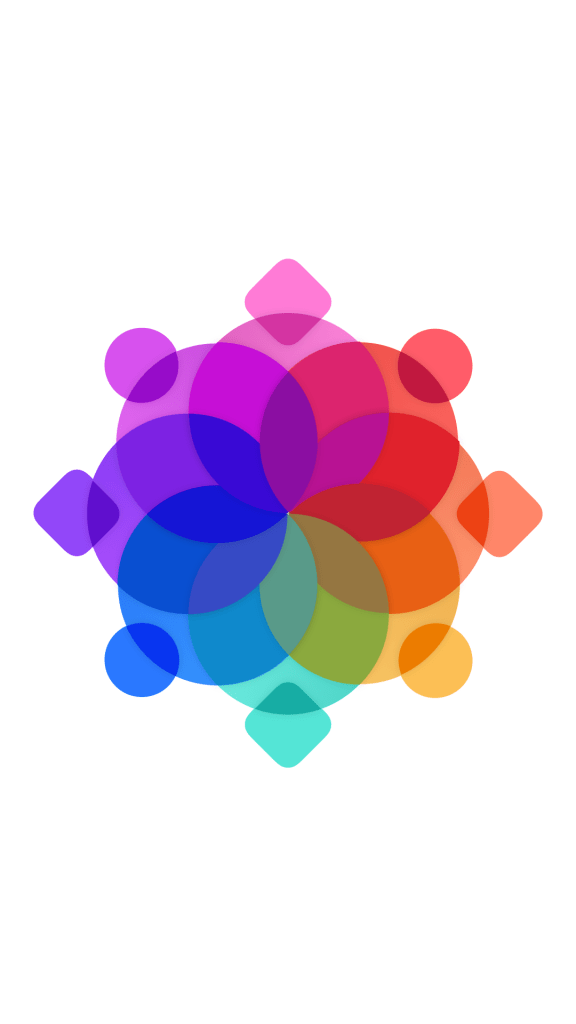
Like project 5, you will be working with transparent shapes, except this time you will be using all 3 primary colors instead of just one. This means that any section where 2 primary colors intersect one another, they will blend optically to form a secondary color. If one color has a higher concentration or chroma than another, the intersection will than become a tertiary color. The terms primary, secondary and tertiary are what make up the color wheel and we should try to become familiar with them. I’ve included descriptions below to make it a little more clear.
Primary – a color which serves as one of the 3 dominant hues on the color wheel and influences the secondary and tertiary mixtures. The 3 primaries are red, yellow and blue.
Secondary – a color which has components of 2 primaries such as an orange which has the influence of both red and yellow hues. The secondary colors are orange, green and purple.
Tertiary – a variation of a secondary color which has a stronger influence of one primary hue. Examples of tertiary colors would be a red-orange, yellow-orange, blue-green, yellow-green or red-purple, blue-purple.
In composing your designs, you want to have a display of all 3 primary and secondary colors. You may also include tertiary colors if it fits the design. For example, if an intense blue intersects a red that has been tinted with white, then the intersection should display a tertiary color of a blue-purple. Below are some examples.


This design is to be created on a 15 x 20 hot press illustration board with acrylic paint.
Good luck!