Hello students,
For project 5 you are to create a simulation of overlapping transparent shapes using 1 primary color plus black and white.
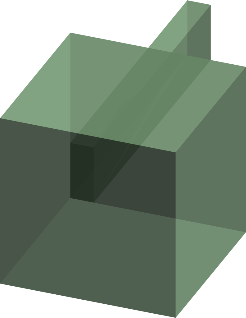
Try to imagine what 2 pieces of tinted glass or plastic would look like if they were placed one over the other. Ultimately you would see an increase in the chroma (intensity of color) and, if more and more pieces were added, eventually the value would get darker as there would be a decrease in transmitted light.
In your design, you want to use flat, solid colored shapes of the same hue, but that differ in value and chroma.
You should include all 3 of the following color variations in your design:
1.) Tint – 1 primary color + white
2.) Shade – 1 primary color + black
3.) Tone – 1 primary color + gray
Remember that you are ultimately trying to create the illusion of transparency. This means that the intersection between 2 colors should be a direct result of those colors. For example, if 2 tinted reds are intersecting one another, then the middle portion will obviously be a deeper/darker red, but only marginally so. You don’t want to exaggerate your contrasts or have too little contrast. You have to use your eye to gauge the color relationships which means that you’ll probably have to periodically adjust the value, chroma and hues within your design.
Below are some examples to hopefully give you a better idea.


This assignment is to be created on a 15 by 20 inch hot press illustration board with a 1 inch border.
All imagery must be painted using Acrylic paint.
Neatness counts! Please use a ruler for measuring and consider using artists tape for painting straight edges!
This assignment will be due on 10/14.
Good luck!
