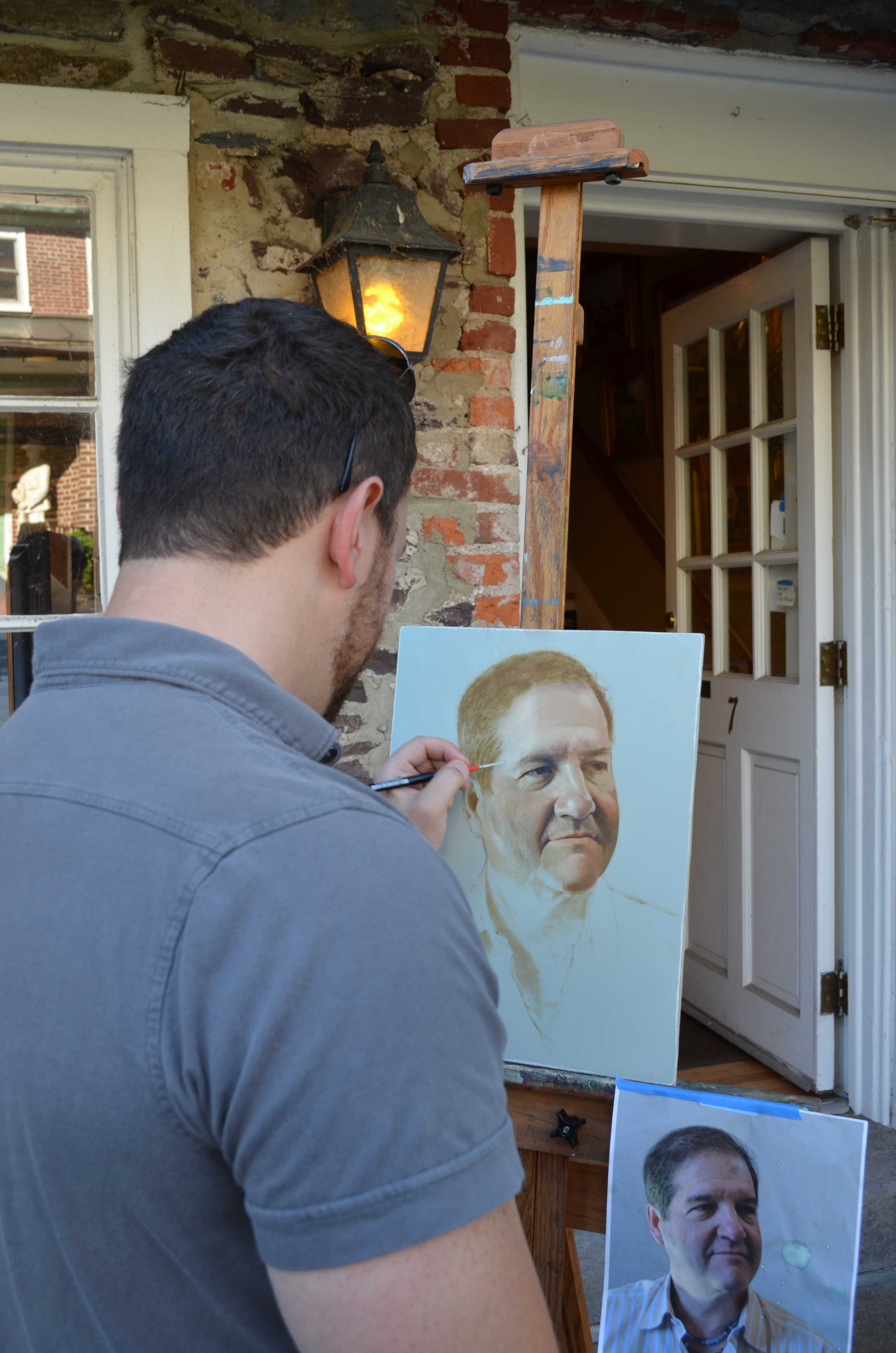
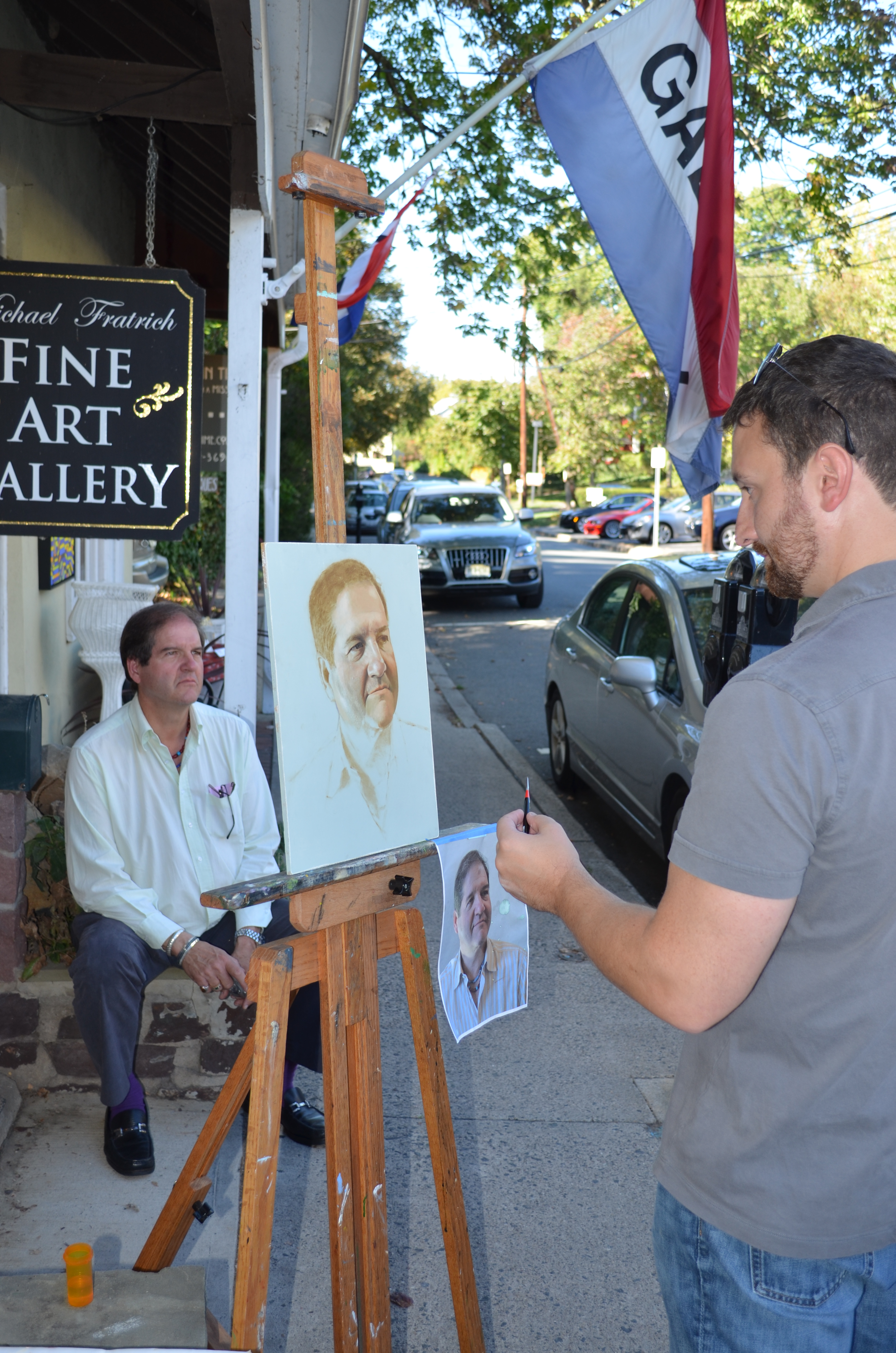
Below are a few shots of me working in front of the Fratrich Gallery in Lambertville New Jersey where I also show my work. I have been doing more and more of these demonstrations in order to show people the way that I paint as well as offer my services to the public as both a commission artist and teacher. At this stage in the painting I am beginning to apply some color, but it is still very limited. I call this dead coloring which is exactly as it sounds. The model’s flesh tones are still somewhat lifeless – the concentration is more on light, shadow, texture and form with the knowledge that I will add brighter and more luminous color in the next few layers. Here my palette consists of only earth tones, (Flake White, Raw Sienna, Transparent Red Oxide, Raw Umber, Chromium Oxide Green and Ivory Black) eliminating purples, bright reds, yellows, blues and oranges. In order to achieve cool tones I have to use white mixed with my black or green. I’m using Transparent Red Oxide and white for my pinks and the Raw Sienna acts as my yellow. Once this dead color layer is complete, I will have a great under-structure to begin glazing brighter, more saturated colors onto. These final layers of semi-transparent color will, essentially, give the flesh tones a living, breathing quality. The blood beneath the skin will become apparent as I selectively begin introducing brighter reds and violets to my palette.
This particular method was used by many artists throughout history. It can perhaps be most effectively observed in 17th Century Dutch painting. When viewing the luminous shimmer of a window light cast upon a wall in a Vermeer interior, or the transparency in the shadow on the face of a Rembrandt portrait, or the full splendor of reds and blues which emerge out of the stark background in a floral still-life by Willem Van Aelst, it is apparent that each of these artists utilized a palette of neutral tones first, which provided them with a strong tonal and pictorial structure to build their images upon. Sometimes darker passages can reveal layers of the underpainting – most often in the shadows or background. But how was such brilliant color achieved at a time when pigments were so scarce? Each layer of paint was a step in a very methodical system. Glazes were often laid over dead color as a wash of pure, brilliant pigment. If, for example, a red glaze were brushed over a gray shadow, the red would retain its full saturation, whereas if it were mixed directly with the gray it would become much duller. The composition of the painting itself, using this method, is based on a fixed sequence of parts which includes drawing, form and color. The color in its finality is conceived even in the beginning stages of a painting. The choices that an artist makes when executing the underpainting supports whatever color or colors are to be added later. This method of working is similar to playing a game of chess where you have to always plan three or four moves ahead in order to achieve a desired outcome.
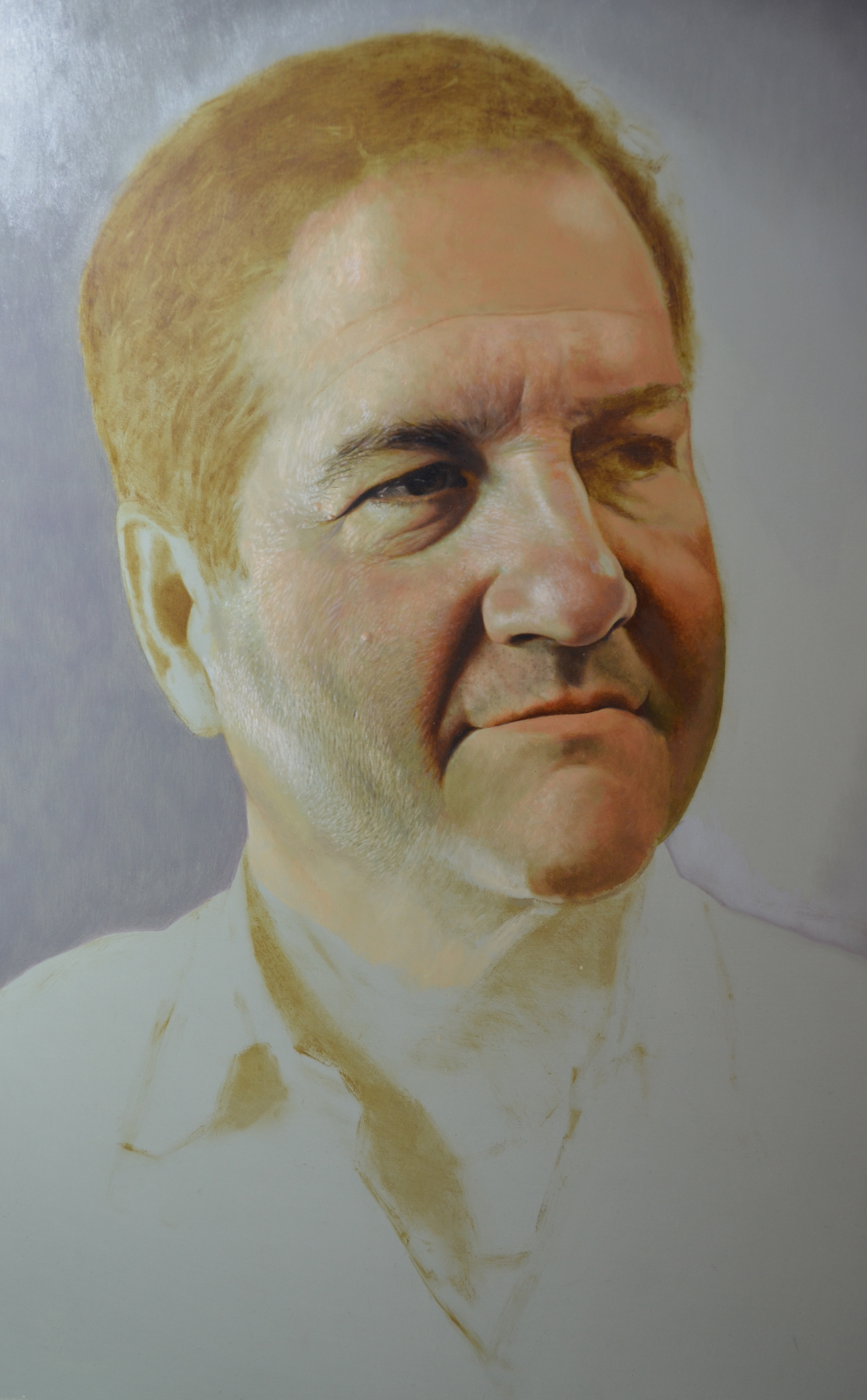

I provided this close up to show how I am depicting the minute details of the skin pores, stubble, wrinkles, etc. All detail in this stage is hyper-focused and will become more subtle as more layers get added. Because I am using a limited palette, my lights are in fact much lighter than they will be in the final image. This example clearly shows where glazing will come in very handy. I am planning to eventually brush a pale, olive-green glaze over the small flicks of light around his jaw which will make the detail less sharp and focused and also vary the color a bit more. With this technique I am exaggerating the detail first, fully aware that it will become more and more subtle with each layer of translucent pigment. Another thing that I wanted to point out was the way that I am laying down my strokes of light. Each mark is descriptive of the form. I am handling my brush here as if I were using a cross contour shading technique with a fine pencil or pen. I imagine that the marks are wrapping around the contours of the form, accentuating each plane.
On a personal note, I am planning on doing demos at the Fratrich Gallery on a monthly basis. Please check out my blog for updates or visit www.michaelfratrich.com! I’d love to see you there next time!
