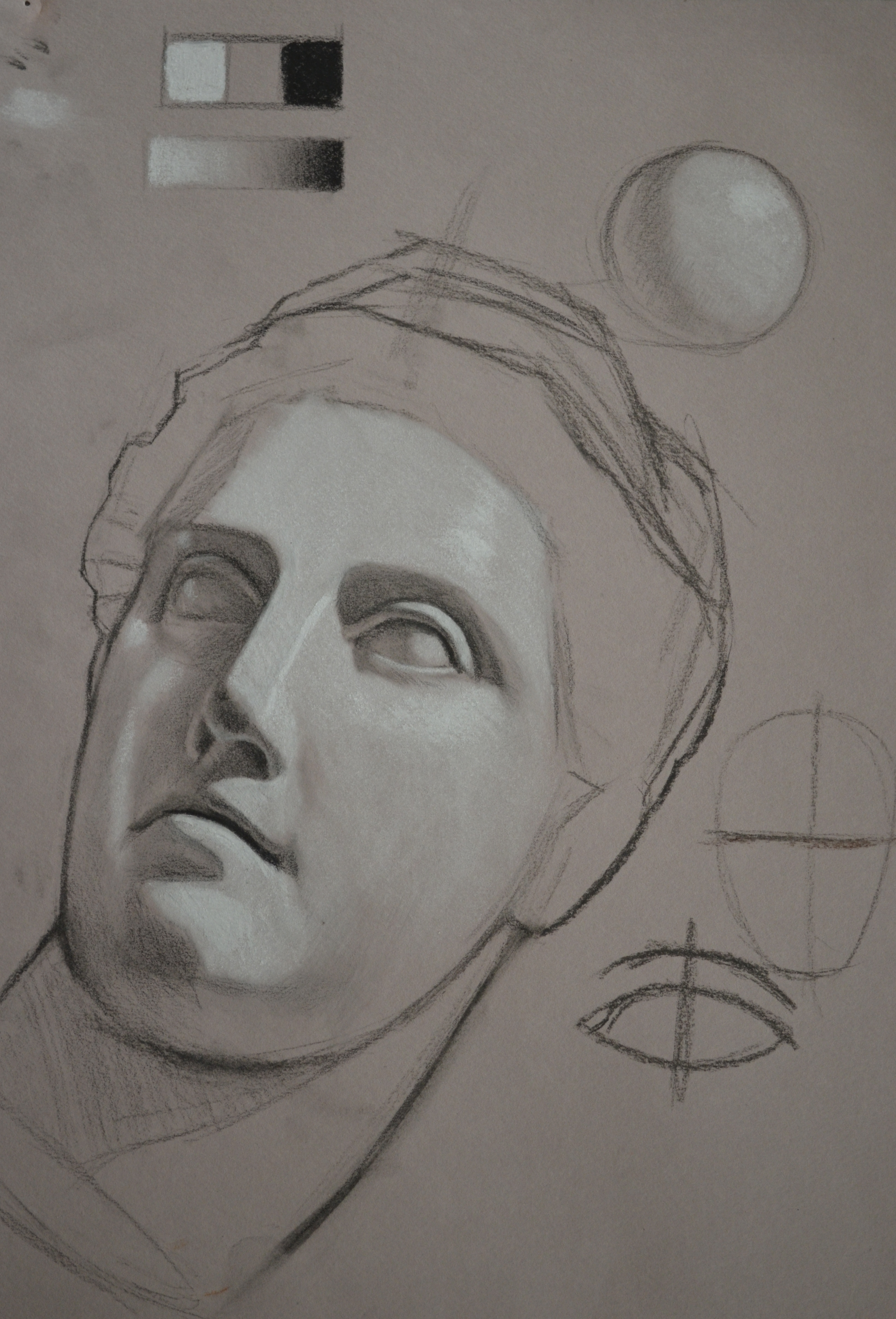
Below is a photo of a class demonstration that I did yesterday using vine and compressed charcoal, a 4B General’s charcoal pencil and white chalk on Mi-Tientes medium grey pastel paper. I also used several brushes (both rounds and flats) for blending the softer tonal gradations. Because the white chalk is itself so soft, brushes work very well as blending tools. Tortillions, because they are harder and more abrasive, tend to lift away the fine particles that sit on the paper and, in a sense, erase what has been put down. For this reason I don’t usually recommend using them for charcoal and chalk drawings. With this particular technique, the grey paper acts as a mid-tone for the drawing and much of the initial shading is done in the lightest areas with the white chalk. As soon as lights are added, the tone of the paper immediately reads much darker. The darkest darks are added selectively towards the end of the drawing process. If they are added too early, everything else gets keyed down into a much darker value range and the contrasts between the lights and darks become too extreme. Although this technique can be a little tricky to get used to at first, it is a great exercise to begin evaluating the lights and darks in a drawing as separate parts which require a specific rendering tool. It is similar to painting a grisaille on a toned ground and I would strongly encourage anyone interested in making the transition from drawing to painting to try this technique. Another advantage is the time it takes to finish a tonal rendering with this technique versus the more common usage of a dark medium such as charcoal or pencil on a white sheet of paper. I executed this demo in two 20 minute segments, spending a total of 40 minutes on the entire thing. I would never have gotten this far if I had attempted to shade all of the subtle gradations of grey tones starting with just the white paper.
One key factor in creating a drawing like this is to use the tone of the paper when needed. You’ll notice in this demonstration a great deal of the half-tones, shadows, reflected lights, etc. were left untouched. In many cases just a hint of light and dark value was needed to shift it in one direction or another rather than a heavy application. If I were to combine my light and dark mediums together it would result in creating yet another value of blue-grey which would be considerably cooler than the tone of the paper. I often will do this when I introduce chromatic greys to my class. When I begin explaining color, I start with light and dark values and slowly introduce other colors to the palette. However, for this exercise I recommend not combining any of the mediums. I will discuss the use of combining different chalks to create chromatic greys in a future post.