Hello all,
I finally set aside some time to write a new post. Over the last few months I’ve started a new series of trompe l’oeil still life’s and I’d like to describe a little bit of my journey. This series is very exciting for me, firstly because the images are tied to my favorite genre of art (trompe l’oeil) and secondly because the tools that I’ve used has changed my perception of what can be achieved with a drawing medium.
For those of you who don’t know me, I’ve always been a practitioner and avid admirer of traditional realism. The 17th Century Dutch period is perhaps my greatest area of study. I love the depth and richness of color that the Dutch were able to achieve with oil paint using a precise layering technique which included under painting and glazing (I’ve written many blogs specifically about this). Recently for me, however, it has become difficult finding time to paint (my work schedule has been keeping me away from the studio) and so, I’ve begun to experiment with a combination of dry mediums, determined to simulate the luminous color effects of an oil painting. After a bit of experimentation, I’ve discovered an approach combining hard pastels, colored pencils, various blending tools and a limited amount of ink which renders effects strikingly similar to an oil. I’ve applied my knowledge of painting indirectly (starting with the lightest color first and gradually adding darks) and have documented the results of my latest piece which I’ve posted below along with brief descriptions of each step.
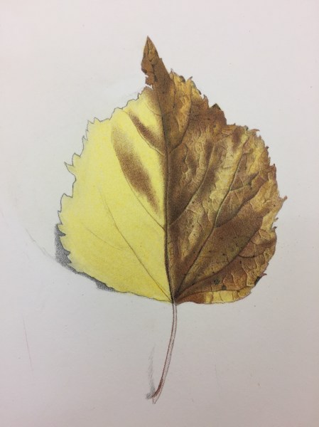
The leaf above was sketched out lightly with a hard 2H pencil. A layer of yellow was then roughly applied with a hard pastel and smoothed out with a semi soft brush (this removes the excess powder which builds up on the paper). As with painting, I try to think about working from light to dark. This gives the final color a luminous glow. I then began to add the intricate network of detail over this initial layer as seen on the right side with finely sharpened colored pencils (mostly Derwent and Prismacolor). As I slowly built up my darks, I also increased my detail. I switched over to a mechanical pencil to emphasize sharp lines such as the cast shadows of the veins. There are a limited number of colored lead sticks available for the Staedtler Mars mechanical pencil holder. I used brown and black. If the contrast needed to be increased any further, I used a .005 Micron black ink pen.
A classic Trompe L’oeil image must include a drop shadow. This creates the illusion that the object is “popping off” the paper. I rendered this shadow seen on the left side of the leaf with various grades of pencils. I started with a 2H and then B and finally a 2B. Each layer was smoothed out with a tortillion prior to applying the next layer. Because the leaf was a warmish color, the pencil tone appeared cooler by contrast. I decided to further the warm/cool contrast by adding a final faint layer of dark blue directly over the gray pencil tone with a Prismacolor colored pencil. I also enjoyed the contrasting edges; the sharp edge of the leaf paired against the soft edge of the shadow.

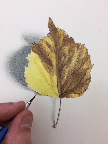
To finish this drawing, I simply continued building up my darks and increasing my detail with the mediums specified above. I am quite pleased with the result. I am planning to do quite a few of these and will be sure to post them as I go so be sure check back periodically.
